Quantcast
Channel: illustrator
Viewing all 56 articles
Browse latest View live

Vetor do Trailer de Breaking Bad no Illustrator

$
0
0
Vetor do Trailer de Breaking Bad no Illustrator

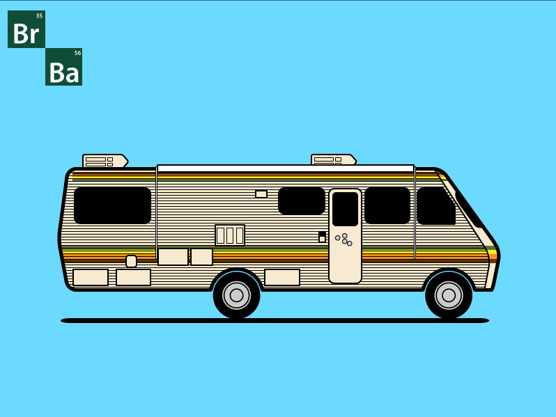
Na semana passada nós postamos sobre novas tendências em ícones e ilustrações. Hoje, depois de assistir horas de Breaking Bad (comecei a assistir algumas semanas atrás e já estou na quinta temporada), eu decidi criar uma ilustração para um wallpaper para meu desktop e laptop, e quis compartilhar o processo de criação aqui com vocês.

No tutorial/estudo de caso de hoje eu vou mostrar para vocês como criar uma ilustração inspirada no trailer da série Breaking Bad.
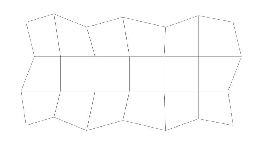
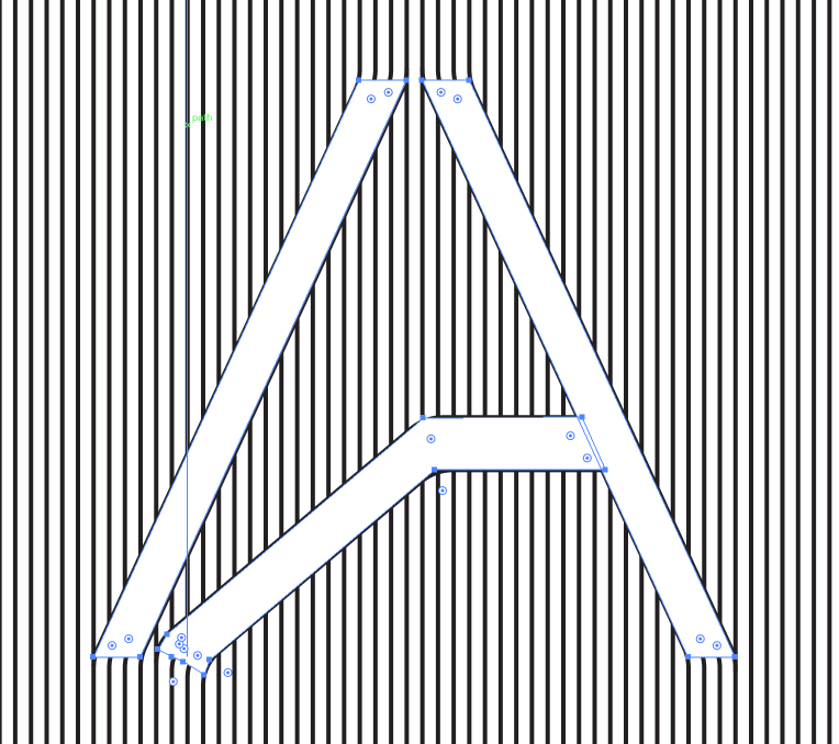
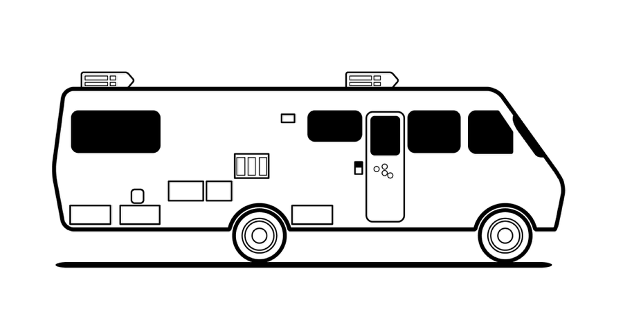
Passo 1

Comece com as formas básicas e contornos. Use Stylize>Round Corners para criar formas arredondadas nas portas, janelas e no trailer em si.
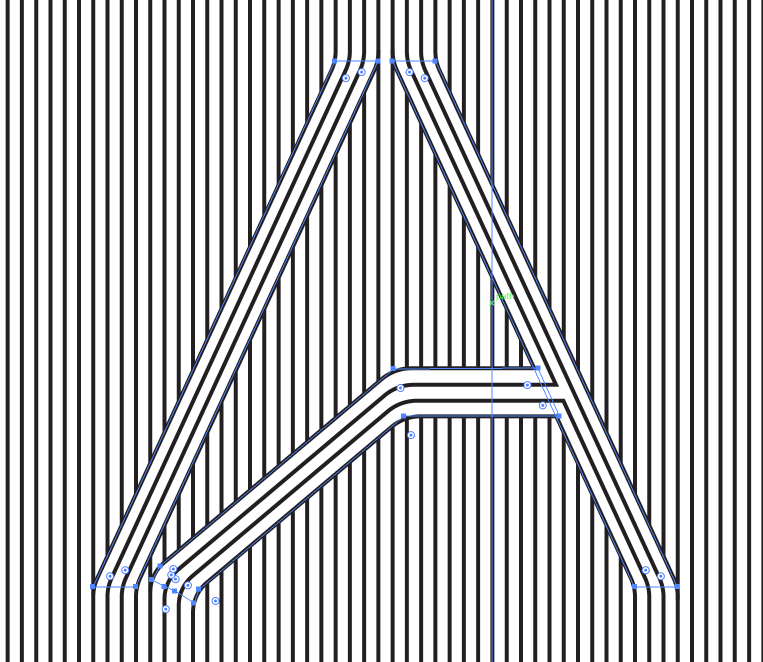
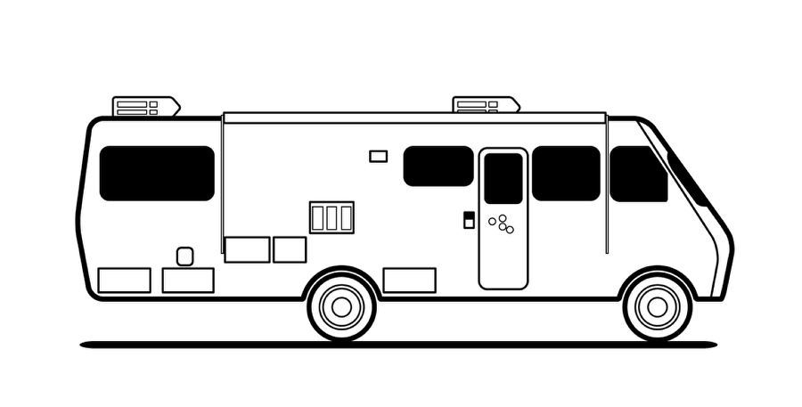
Breaking Bad RV in Illustrator

Passo 2

Depois que fizer as formas básicas faça os contornos do trailer, usando linhas mais grossas que no restante. Brinque um pouco com o peso do stroke.
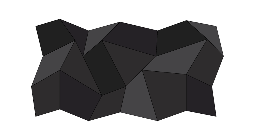
Breaking Bad RV in Illustrator

Passo 3

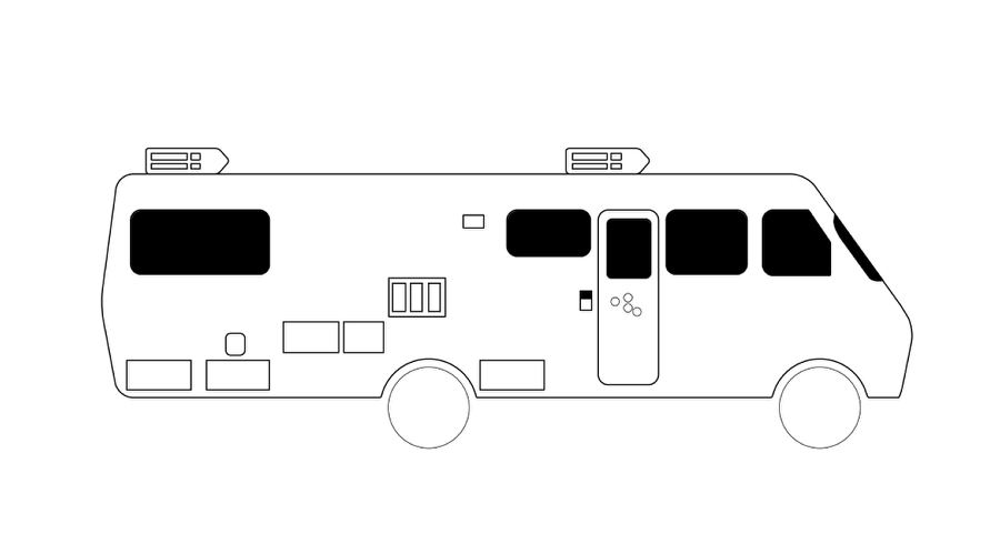
Adicione detalhes do trailer.
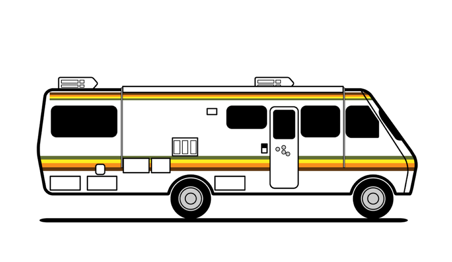
Breaking Bad RV in Illustrator

Passo 4

Hora de dar cor ao desenho. Vamos colorir primeiro as listras básicas. Aproveite para pintar também as rodas e os buracos de bala na porta.

Breaking Bad RV in Illustrator

Passo 5

Use uma cor bege no trailer.
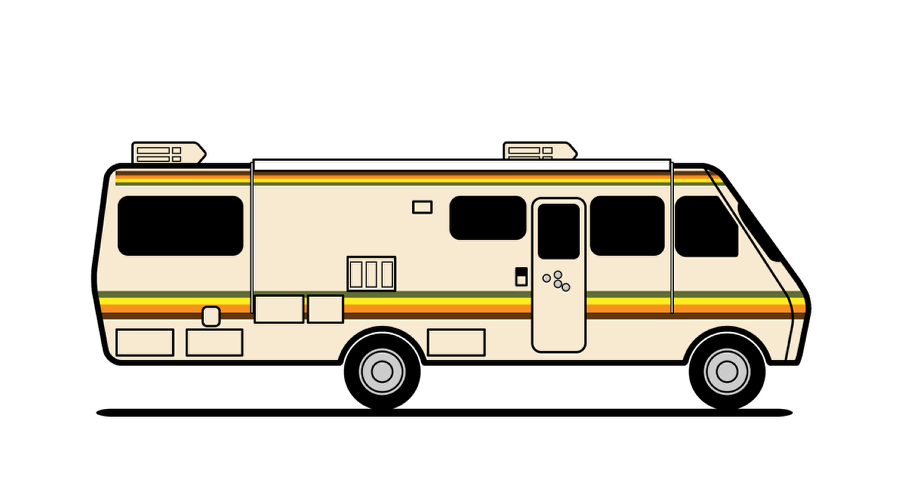
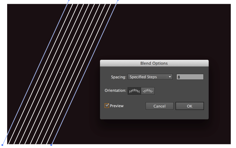
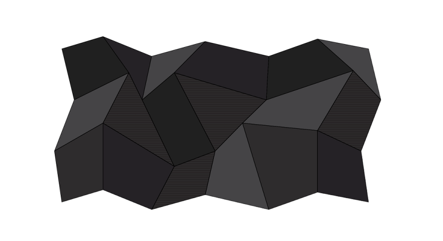
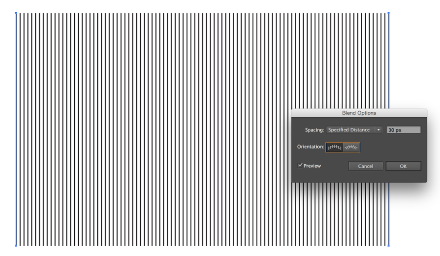
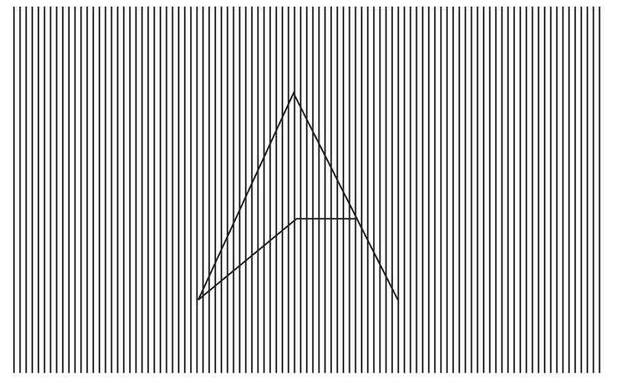
Breaking Bad RV in Illustrator

Passo 6

Use a Blend Tool para criar a textura de metal do trailer.
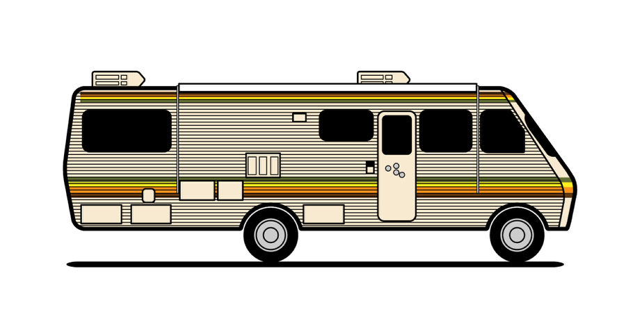
Breaking Bad RV in Illustrator

Passo 7

Aqui está o vetor básico.
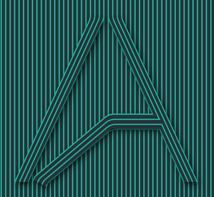
Breaking Bad RV in Illustrator

Conclusão

Agora adicione apenas um azul legal para o fundo e coloque também o logo da série para finalizar a peça. Não tem nada de novo no processo mas o legal é praticar no Illustrator e criar algo em homenagem a série Breaking Bad. Agora é com você!

Breaking Bad RV in Illustrator

Download do arquivo Illustrator

Faça o Download do arquivo usado no tutorial


Padrão ABDZ no Illustrator

$
0
0
Padrão ABDZ no Illustrator

Eu tenho tirado várias fotos desde que comecei meu projeto "uma foto por dia" esse ano. Eu comprei uma câmera boa e comecei a fotografar basicamente tudo que me inspira. Em uma visita a Bloomington, Indiana, eu encontrei um padrão muito legal no piso do banheiro e resolvi recriar o padrão no Illustrator.

No tutorial de hoje vou mostrar para vocês como criar padrões vetor no Illustrator. O processo é super simples mas com ele você poderá criar padrões muito legais para futuros projetos. Confira.

Passo 1

Usando a foto que tirei para inspiração e referência, importei a imagem para o Illustrator.

ABDZ Weave Pattern

Passo 2

Usando a Rectangle Tool, comece recriando a forma básica do padrão.

ABDZ Weave Pattern

Passo 3

Assim que tiver as formas básicas comece a brincar com cores e sombras. Para as cores eu usei Adobe Kuler (https://kuler.adobe.com/create/color-wheel/) como referência. Perceba que nesse passo você ainda está criando a forma básica do tile.

ABDZ Weave Pattern

Passo 4

Para criar o padrão você precisa garantir que sua arte é tile-able. Abaixo você pode conferir a forma final que obtive para garantir que o padrão seja escalável.

ABDZ Weave Pattern

Passo 5

Selecione seu design e vá até Object>Pattern>Make. Use ajustes default e clique Done. Seu padrão será adicionado ao Swatch pane. Você pode sempre dar um duplo clique para editar. Troque cores e tudo mais que achar necessário.

ABDZ Weave Pattern

Conclusão

Aqui está o design final. Hard shadows e estilo vetor dão um visual bacana. A forma é a mesma da foto que tirei, apenas tem um visual mais moderno e fica muito legal como um wallpaper para seu computador, tablet ou smartphone. Agora é com você. Tire fotografias de padrões que goste e crie suas próprias versões.

ABDZ Weave Pattern

Arquivo Illustrator

Faça o Download do Arquivo Illustrator

Wallpaper com Pensamentos Positivos no Illustrator

$
0
0
Wallpaper com Pensamentos Positivos no Illustrator

Estou sempre trocando o wallpaper do meu computador. Por mais que não troque muito nos meus devices móveis, meu computador nunca fica muito tempo com o mesmo wallpaper. Para me inspirar um pouco decidi fazer uma série de wallpapers com frases de pensamentos positivos. A primeira é de Mark Twain e o tema é inspirado em um anúncios dos anos 80, minha década favorita. Em termos de ferramentas, para o wallpaper de hoje eu usei o Illustrator e o Photoshop mas meu objetivo é usar Sketch e outros aplicativos.

Esse não é bem um tutorial, é um pequeno estudo de caso da criação do wallpaper. Não vou compartilhar muitos detalhes, vamos usar a série como uma oportunidade de explorar o Illustrator, Photoshop, Sketch e outras ferramentas.

Passo 1

Abra o Illustrator e crie um novo documento. Para wallpapers usei 2880x1800 pixels. Com a Line Segment Tool (\) crie 2 linhas. Estou usando o mesmo ângulo do logo do Abduzeedo.

Positive Thinking Wallpaper in Illustrator

Passo 2

Com a Blend Tool crie 8 passos a partir das linhas.

Positive Thinking Wallpaper in Illustrator

Passo 3

Agora usando color spectrum, mude as cores das linhas de amarelo para verde.

Positive Thinking Wallpaper in Illustrator

Passo 4

A ideia para os próximos wallpapers é usar pensamentos positivos para motivar nosso dia a dia. A primeira frase de Mark Twain, que diz "I've had a lot of horries in my life, most of which never happened" ("eu tive muitas preocupações em minha vida, muitas delas nunca aconteceram").

Positive Thinking Wallpaper in Illustrator

Passo 5

Com a Direct Selection Tool (A) edite a caixa texto para ter o mesmo ângulo das linhas.

Positive Thinking Wallpaper in Illustrator

Passo 6

Para finalizar o primeiro wallpaper eu apenas coloquei o logo Abduzeedo no centro.

Positive Thinking Wallpaper in Illustrator

Conclusão

Não sou grande fã de vetor puro, não sei porque, mas sempre gosto de adicionar uma textura. Então no Photoshop eu adicionei uma textura de papel simples para deixar com "menos cara de vetor". A ideia foi criar um wallpaper com um visual anos 80. Espero que gostem e que volte na semana que vem para conferir o próximo.

Positive Thinking Wallpaper in Illustrator

Download Photoshop

Download Photoshop file

San Francisco Skyline no Illustrator

$
0
0
San Francisco Skyline no Illustrator

Algumas semanas atrás eu decidi praticar minhas habilidades no Illustrator e resolvi criar uma versão simples do skyline de San Francisco para um material em que estou trabalhando. Eu adorei o estilo que Ryan Putnam explorou em algumas de suas ilustração do skyline de outras cidades e resolvi tentar fazer um estilo semelhante. E tenho que dizer, não me diverti tanto fazendo ilustrações desde o tempo em que estava estudando.

Hoje vou mostrar aqui o processo criativo básico por trás da arte que fiz. Usei o Adobe Illustrator para o projeto, mas o mesmo também pode ser feito com qualquer ferramenta de vetor.

Passo 1 - Referências

O primeiro passo foi buscar referências dos prédios icônicos do skyline da cidade. San Francisco é uma bela cidade e foi super fácil encontrar os pontos principais da ilustração. Os que escolhi foram o Transamerica Pyramid, Ferry Building, Embarcadero Center, Alcatraz, Cable Car, a neblina e é claro, a Golden Gate. Confira abaixo as referências.

San Francisco Skyline in Illustrator

San Francisco Skyline in Illustrator

San Francisco Skyline in Illustrator

San Francisco Skyline in Illustrator

Passo 2

Para criar os prédios eu usei formas básicas e a Blend Tool para fazer as janelas. Confira o processo do Transamerica Pyramid.

San Francisco Skyline in Illustrator

Passo 3

No Embarcadero Center eu usei a rectangle tool para criar o prédio. Para as janelas eu usei apenas uma dotted stroke line. Depois de fazer a primeira metade eu apenas dupliquei e pronto, mais um prédio feito.

San Francisco Skyline in Illustrator

Passo 4

O Ferry Building levou mais tempo para completar pelo seu estilo arquitetônico. Mas também usei formas básicas e muita repetição. O segredo foi capturar os detalhes mais importantes, não precisava ficar totalmente perfeito.

San Francisco Skyline in Illustrator

Passo 5

Montar tudo foi super divertido. Comecei a adicionar alguns placeholder buildings para preencher espaços. Na Golden Gate eu usei a Blend Tool e também criei a neblina com vários círculos que mais tarde uni com a pathfinder tool. O legal desse tipo de ilustração é que você cria a arte facilmente, precisa apenas de tempo e paciência. Outra dica importante é fazer o outer stroke dos prédios maior que o inner.

San Francisco Skyline in Illustrator

Conclusão

A versão final está feita mas ainda não posso mostrar. Em breve eu falo mais detalhes. Abaixo você pode conferir duas versões, um print mockup e um gif animado.

San Francisco Skyline in Illustrator

San Francisco Skyline in Illustrator

ABDZ no Illustrator

$
0
0
ABDZ no Illustrator

Na última sexta eu comprei o jogo Monument Valley e não demorou muito para eu ficar fã. A direção de arte é fantástica, cheia de quebra cabeças muito bem feitos que brincam com formas impossíveis, você consegue imaginar que poderia ser um jogo feito por M.C Escher. Depois que algumas horas jogando eu me inspirei para criar uma arte para o Abduzeedo. Depois de um bom tempo no Illustrator e Photoshop, o resultado foi uma arte legal para um poster e wallpaper.

Então no estudo de caso/tutorial de hoje eu vou mostrar o processo por trás do símbolo que criei usando Illustrator e Photoshop.

Passo 1

No Illustrator comece a criar um triângulo básico usando a Rectangle Tool e a Direct Selection Tool. Crie a face frontal, a que tem um tom cinza claro e depois crie a face traseira na esquerda com cinza escuro, depois a face do topo com cinza médio.

Impossible ABDZ

Passo 2

Adicione a parte de baixo com o mesmo cinza da parte traseira do passo anterior.

Impossible ABDZ

Passo 3

Adicione a parte frontal da parte de baixo usando o mesmo cinza do passo um. Conecte eles estendendo a face do topo da direita. Faça alguns ajustes para deixar os vértices alinhados.

Impossible ABDZ

Passo 4

Aqui eu decidi editar meu triângulo penrose para deixar mais parecido com o símbolo do Abduzeedo .

Impossible ABDZ

Passo 5

Aqui eu decidi brincar com algumas sombras para adicionar profundidade, a primeira ideia foi seguir um rendering com cinzas e gradientes.

Impossible ABDZ

Passo 6

Esse foi meu primeiro resultado, inspirado no Monument Valley do jogo. Ficou legal mas eu queria algo mais simples.

Impossible ABDZ

Passo 7

Decidi usar só os contornos, é um estilo super comum mas vi que não tinha feito nada assim para o Abduzeedo. O primeiro passo foi remover fill colors e adicionar stroke. Depois eu usei Pathfinder para garantir que as formas não ficariam uma por cima da outra.

Impossible ABDZ

Conclusão

Aqui está o resultado final, apenas aumente o peso dos strokes e adicione alguns detalhes no Illustrator. Você pode adicionar texturas e outros elementos. Eu gostei bastante do resultado e estou usando como desktop wallpaper.

Impossible ABDZ

Impossible ABDZ

Impossible ABDZ

Experimento com Triângulos no Photoshop

$
0
0
Experimento com Triângulos no Photoshop

Já faz um tempo desde o meu último experimento com novas ideias. Por isso hoje eu decidi dar uma conferida nas minhas fontes pessoais para procurar inspiração, fontes como Pinterest, etc. Encontrei várias imagens bacanas de diversos artistas, em particular o trabalho de Sarah Mick. Também continuo adorando o jogo Monument Valley, que também me inspirou para o post de hoje.

No tutorial de hoje vou mostrar para vocês como criar um wallpaper super simples usando Photoshop e Illustrator. O processo é simples e o resultado é muito legal (na minha opinião).

Passo 1

Crie um novo documento no Illustrator e crie 2 quadrados como na imagem abaixo. O menor é preto e o maior é um cinza medio.

Playing with Triangles in Photoshop

Passo 2

Em Blend Options selecione os dois quadrados e crie um blend com 3 Specified Steps.

Playing with Triangles in Photoshop

Passo 3

Adicione um retângulo para o background em cinza claro como na imagem abaixo.

Playing with Triangles in Photoshop

Passo 4

Copie a imagem do Illustrator e cole no Photoshop.

Playing with Triangles in Photoshop

Passo 5

Vá até Filter>Blur Gallery>Tilt-Shift. Use 15 pixels em Tilt-Shift e 0 distortion.

Playing with Triangles in Photoshop

Passo 6

Vamos adicionar uma imagem ao background. Estou usando uma imagem de céu em grey scale que encontrei no Google Images. Depois disso eu fiz mask para garantir que nada ficaria por cima dos triângulos.

Playing with Triangles in Photoshop

Passo 7

Vá até Layer>New Adjustment Layer>Hue and Saturation. Use 195 em Hue e 43 em Saturation.

Playing with Triangles in Photoshop

Passo 8

Agora selecione todas as layers e faça merge em uma nova layer. Depois disso vá até Filter>Noise>Add Noise. Use 2% em Amount e Gaussian em Distribution.

Playing with Triangles in Photoshop

Conclusão

Agora apenas adicione seu texto e logo e está pronto. É uma arte simples mas que tem um apelo visual legal. Agora é com você, divirta-se!

Playing with Triangles in Photoshop

Download

Download arquivo Photoshop

Brought to you by: 

Typographic Logo in Illustrator and Photoshop

$
0
0
Typographic Logo in Illustrator and Photoshop

I have been playing more with simple stencil style logos in my spare time, especially because it requires a lot of practice and attention to detail. I surely have a lot to improve upon and that's why I have been spending time trying to recreate this style using Illustrator and Photoshop.

For this tutorial I will show you how to use simple Illustrator tools to create a very trendy logo. The process is quite simple and can be applied to all sorts of logos and illustrations for your future projects.

Step 1

In Illustrator create a simple stencil using basic shapes and different fonts. The fonts I used here can be found at the Lost Type http://losttype.com/browse/ -

Typography Stencil in Illustrator

Step 2

Let's start adding some effects. The first one is the Blend effect. Select the word New York and duplicate it. Change the color of the duplicated word to white and make sure it's underneath the black one. After that go to Object>Blend - Use 4 pixels for the Spacing with Specified Distance.

Typography Stencil in Illustrator

Step 3

Repeat the same thing to create a simple effect of diagonal lines for the top horizontal dividers.

Typography Stencil in Illustrator

Step 4

Select the first text and go to Object>Envelope Distort>Envelope with Warp. Use Arc for the Style with 30% for the Bend.

Typography Stencil in Illustrator

Step 5

Repeat the same thing for the text at the bottom.

Typography Stencil in Illustrator

Step 6

Select the rectangles and text used to create the ribbon and go again to Object>Envelope Distort>Envelop with Warp... - Use -30% for the Bend with Arc for the Style.

Typography Stencil in Illustrator

Step 7

Here's the final result of the stencil.

Typography Stencil in Illustrator

Step 8

Now in Photoshop, I used one of the photos I took while I was in New York. Import it to Photoshop and crop it to fit the canvas size you are working on. In my case, 2880x1800 pixels.

Typography Stencil in Illustrator

Step 9

Add a new layer and fill it with a simple grey/green color. After that change the opacity to 60%.

Typography Stencil in Illustrator

Step 10

Add another layer and fill it with a gradient from black to white in the center. After that change the Blend Mode to Multiply at 80%.

Typography Stencil in Illustrator

Step 11

Copy the logo from Illustrator and paste it in Photoshop.

Typography Stencil in Illustrator

Step 12

Go to Image>Adjustments>Invert. After that change the Blend Mode to Lighten.

Typography Stencil in Illustrator

Step 13

Go to Layer>New Adjustment Layer>Photo Filter. Use Cooling Filter with 25% for Density.

Typography Stencil in Illustrator

Conclusion

After over one hour you can have something similar to the result I got. This was a simple exercise to try to recreate some of the awesome logos I see in most of the design sites out there. I know there's a lot to refine, but this was as I said, a simple playing time with Illustrator and Photoshop trying to learn more about this very trendy and I'd say hipster style. I hope you have fun creating your own version.

Typography Stencil in Illustrator

Typography Stencil in Illustrator

Download .AI file

ABDZ Weave Pattern in Illustrator

$
0
0
ABDZ Weave Pattern in Illustrator

I have been taking a lot of pictures since I decided to do a photo a day project this year. I got a good camera and started taking pictures of pretty much everything that inspired me. I was in Bloomington, Indiana and I was really amazed by the pattern of the bathroom floor. I took a photo and decided to recreate it as pattern in Illustrator.

So in this little tutorial I will show you how to create vector patterns in Illustrator. The process is quite simple but you will be able to create really amazing patterns for future projects.

Step 1

Using the photo I took for inspiration and reference I imported it to Illustrator.

ABDZ Weave Pattern

Step 2

Using the Rectangle Tool, start recreating the basics of that pattern.

ABDZ Weave Pattern

Step 3

Once you have the basic shapes right, start playing with colors and shadows. For the colors I used Adobe Kuler (https://kuler.adobe.com/create/color-wheel/) for reference. Note that at this step you are still creating the basic title.

ABDZ Weave Pattern

Step 4

Now in order to make the pattern you have to make sure that your artwork is tile-able. Below you can see the final form I ended up getting to make sure that the pattern will be scaleable.

ABDZ Weave Pattern

Step 5

Select your design and go to Object>Pattern>Make. Use the default settings and click Done. Your patter will be added to the Swatch pane. You can always double click to edit it. You can change colors and pretty much everything.

ABDZ Weave Pattern

Conclusion

Here's the final design. The hard shadows and the vector style give it a really nice feel. The form is the same as the photo I took, but just with a more modern feel and it does look really cool as a wallpaper for your computer, tablet and phone. Now it's up to you. Take pictures of patterns you see on the streets, you never know when you might need some references.

ABDZ Weave Pattern

Illustrator source file

Download Illustrator file


Positive Thinking Wallpaper in Illustrator

$
0
0
Positive Thinking Wallpaper in Illustrator

I am always change the wallpaper of my computer, not so much on my mobile devices, I don't know why. The only think I know is that I look at my wallpaper quite a lot because of the second monitor. In order to get some inspiration I decided to start a series of wallpapers with positive thinking quotes. The first one is from Mark Twain and the theme is inspired by an ad from the 80s, my favorite decade for sure. In terms of tools, for this one I will use Illustrator and Photoshop but my goal is to use Sketch and other apps as well.

This is not a tutorial per se, it's just a little case study or behind the scene of how I create this wallpaper and the future ones. There won't be a lot of details, but it's an opportunity for me to explore more Illustrator, Photoshop, Sketch or any tool that comes to my mind.

Step 1

Open Illustrator and create a new document. For wallpapers I used 2880x1800 pixels. After that with the Line Segment Tool (\) create 2 lines. I am using the same angle of the Abduzeedo logo.

Positive Thinking Wallpaper in Illustrator

Step 2

With the Blend Tool create 8 steps from the two lines.

Positive Thinking Wallpaper in Illustrator

Step 3

Now using the color spectrum, change the colors of the lines going from yellow to green.

Positive Thinking Wallpaper in Illustrator

Step 4

The idea for this future wallpapers is to use a positive thinking quote. The first one is from Mark Twain, and it says "I've had a lot of horries in my life, most of which never happened".

Positive Thinking Wallpaper in Illustrator

Step 5

With the Direct Selection Tool (A) edit the text box to have the same angle of the lines.

Positive Thinking Wallpaper in Illustrator

Step 6

To finish this first wallpaper I just placed the Abduzeedo logo in the center.

Positive Thinking Wallpaper in Illustrator

Conclusion

I am not fan of pure vectors, I don't know why but I always like to add a little texture. So in Photoshop I added a simple paper texture to make it less "vector". The whole idea of this first wallpaper was to explore my favorite theme, 80s with a simple and elegant wallpaper. I hope you had fun and let's see what comes next week.

Positive Thinking Wallpaper in Illustrator

Download Photoshop

Download Photoshop file

San Francisco Skyline in Illustrator

$
0
0
San Francisco Skyline in Illustrator

A couple of weeks ago I decided to practice my Illustrator skills to create a simple skyline of San Francisco for a print material I am working on. I loved the style that Ryan Putnam explored on some of his illustrations of city skylines so I decided to give it a try. I have to say, I didn't have that much fun doing illustrations since I was in high school I think.

So in this short post I will walk you through my basic creative process behind the San Francisco Skyline illustration. I used Adobe Illustration for this project but it can be done with any vector tool.

Step 1 - References

The first step was to get references of some iconic buildings in the San Francisco skyline. San Francisco is a beautiful city and it was very easy to get a few landmarks. The ones I picked was, Transamerica Pyramid, Ferry Building, Embarcadero Center, Alcatraz, Cable Car, the fog and of course the Golden Gate Bridge. Below you can see some references.

San Francisco Skyline in Illustrator

San Francisco Skyline in Illustrator

San Francisco Skyline in Illustrator

San Francisco Skyline in Illustrator

Step 2

To create the buildings I used basic shapes and the Blend Tool to make the windows. Below you can see the process behind the Transamerica Pyramid.

San Francisco Skyline in Illustrator

Step 3

The Embarcadero Center I used the rectangle tool to create half of the building. For the windows, I just used a dotted stroke line. After the first half was done, I just duplicated it and there it was, another building.

San Francisco Skyline in Illustrator

Step 4

The Ferry Building took more time because of its architecture style. But again, just basic forms and a lot of repetition. The secret is to capture the most important features, it doesn't have to be perfect.

San Francisco Skyline in Illustrator

Step 5

Putting everything together was a lot of fun. I started adding some placeholder buildings to fill the space. For the Golden Gate Bridge I used the Blend Tool and also created the fog with a bunch of circles that later on I united them with the pathfinder tool. The cool thing about this type of illustration is that you can create it quite easily, it just require time. Another important tip is to make the outer stroke of the buildings bigger than the inner.

San Francisco Skyline in Illustrator

Conclusion

The final print is done but not ready to be shown yet. Soon I will have more details, but below you can see two explorations, one in a print mockup and another one a simple animated gif.

San Francisco Skyline in Illustrator

San Francisco Skyline in Illustrator

Impossible ABDZ in Illustrator

$
0
0
Impossible ABDZ in Illustrator

Last Friday I bought the game Monument Valley and got hooked an an instant. The art direction is fantastic, full of beautifully designed puzzles playing with impossible forms, you feel it could be a game designed by M.C Escher. A few hours playing and I was inspired to create an artwork for Abduzeedo, just to have some fun. The end result, and some quality time in Illustrator and Photoshop, I ended up with an outline style artwork for a poster and wallpaper.

So in this little case study/tutorial I will show you the process behind my impossible ABDZ symbol using Illustrator and Photoshop.

Step 1

In Illustrator start creating a basic triangle using the Rectangle Tool and then the Direct Selection Tool. Create the front face, the one with the lighter grey and then the back face on the left with a darker grey and the top face on the right with a mid grey.

Impossible ABDZ

Step 2

Add the bottom part with the same grey as the back face part in step one.

Impossible ABDZ

Step 3

Add the top face of the bottom part using the same grey as the top face in step one. Connect them by extending the right top face. Make some adjustments to make sure the vertices are aligned.

Impossible ABDZ

Step 4

Here I decided to edit my penrose triangle to have a little bit of the Abduzeedo Symbol form.

Impossible ABDZ

Step 5

Here I decided to play with some shadows to add some depth, the first idea was to follow a nice rendering with greys and gradients.

Impossible ABDZ

Step 6

This was my first outcome, it was heavily inspired by the game Monument Valley. It was nice but I wanted something simpler.

Impossible ABDZ

Step 7

I decided to to use just the outlines, it is a quite common style but I realised I haven't done something like that for Abduzeedo. The first thing was to remove the fill colors and just add a stroke. After that I used Pathfinder to make sure the shapes are not overlapping on another.

Impossible ABDZ

Conclusion

Here's the final result, just increase the weight of the strokes and added a few more details in Illustrator. You can add textures or more elements if you want, but for now I am pretty happy with the outcome, especially using as my desktop wallpaper.

Impossible ABDZ

Impossible ABDZ

Impossible ABDZ

Surf Bottle - Case Study

$
0
0
Surf Bottle - Case Study

It's been a minute since we've featured a case study on illustration here at Abduzeedo so we felt the need to showcase something special. We're excited to share the work of Anna Kočová via the illustration entitled Surf Bottle. Anna shares with us the process behind the illustration from the basic sketches to the final result.

For more information about Anna check out her Behance profile at https://www.behance.net/annakocova

Playing with Triangles in Photoshop

$
0
0
Playing with Triangles in Photoshop

It's been quite some time since I've experimented with new ideas. Today, I decided to go through my personal library of inspiration, likes on Pinterest, etc and found some really good images from various artists, in particular the work of Sarah Mick. I am also still in love with the game Monument Valley, so this post also has much inspiration drawn from that visual language.

Let's get to it. In this tutorial I will show you how to create a super simple wallpaper using Photoshop and Illustrator. The process is very straightforward but the result is quite good in my opinion.

Step 1

Create a new document in Illustrator and then create 2 squares like the image below. The smallest one in black and the bigger one in medium grey.

Playing with Triangles in Photoshop

Step 2

With the Blend Options select both squares and them create a blend with 3 Specified Steps.

Playing with Triangles in Photoshop

Step 3

Add another rectangle for the background with a light grey, like the image below.

Playing with Triangles in Photoshop

Step 4

Copy the image from Illustrator and paste it in Photoshop.

Playing with Triangles in Photoshop

Step 5

Go to Filter>Blur Gallery>Tilt-Shift. Use 15 pixels for the Tilt-Shift and 0 distortion.

Playing with Triangles in Photoshop

Step 6

Let's add an image for the background. I am using a sky image in grey scale that I found on Google Images. After that I masked it to make sure it wasn't overlapping the triangles.

Playing with Triangles in Photoshop

Step 7

Go to Layer>New Adjustment Layer>Hue and Saturation. Use 195 for Hue and 43 for Saturation.

Playing with Triangles in Photoshop

Step 8

Now select all layers and then merge them into a new layer. After that go to Filter>Noise>Add Noise. Use 2% for the Amount and Gaussian for the Distribution.

Playing with Triangles in Photoshop

Conclusion

Now just add your text and logo and you are good to go. It's a simple artwork but has some strong visual appeal because of the triangles and since I saw some posters on Behance and the game The Monument Valley I fell in love with this concept. Now it's up to you, just go and have some fun!

Playing with Triangles in Photoshop

Download

Download the Photoshop file

Playing with Ligatures

$
0
0
Playing with Ligatures

Last week I posted a couple articles on typography, more precisely ligatures, and despite the fact I have never been a huge fan of this style it is extremely popular. With that in mind I decided to practice and learn more about it. For this first image, I've created a simple composition in Illustrator using a popular quote. The process is quite simple, I just played with text sizes and tried to connect the ligatures albeit in different rows. So for this post I will walk you through my process very briefly though I must admit it took me quite some time to achieve a work that satisfied.

Step 1

Create a new document in Illustrator and with the Horizontal Type Tool add the text you want to use for the composition. I am using a quote that was said to be Mark Twain's but there are controversies. The font I am using is PF Champion Script and it can be purchased at https://www.myfonts.com/fonts/parachute/pf-champion-script-pro/

Playing with Ligatures

Step 2

Reorganize the words and try to connect them by the ligatures.

Playing with Ligatures

Step 3

The font comes with fantastic glyphs and they are perfect to fill some areas between words.

Playing with Ligatures

Step 4

For the "The" I used to glypch, one connected with the "T" and the other with the "e".

Playing with Ligatures

Step 5

Here's the final text composition.

Playing with Ligatures

Step 6

Now let's start adding some subtle shadows. I used this effect for letters that have crossing segments and any looping form.

Playing with Ligatures

Step 7

The final colors I used were #242529 for the background and #D4EA61 for the text.

Playing with Ligatures

Conclusion

The final composition is fairly simple, the goal is to drive all the attention to the text and ligatures. I also added the Abduzeedo logo using #FF4240 to create some contrast. Besides that I also created another version with a super cool pattern from The Pattenr Library titled Shattered Island (http://thepatternlibrary.com/#shattered-island). You can try different variations, but now it's up to you, meanwhile I will keep playing and trying to refine my ligature skills.

Playing with Ligatures

Playing with Ligatures

Vector Polygonal Background in Illustrator

$
0
0
Vector Polygonal Background in Illustrator

A couple of weeks ago I posted an image with a polygonal background that I discovered on the Pattern Library website and got some requests to recreate so herein lies my attempt. So in this tutorial I will show you how to create a vector polygonal pattern using Illustrator and the Pattern make feature. The process is quite simple but there are some details that are very important to make sure your pattern is tileable.

Step 1

Open Illustrator and create a new document. With the Rectangle Tool create a square like the image below.

Vector Polygonal Background in Illustrator

Step 2

Duplicate the square by holding Option+Shift. Make sure they snap with no space between them.

Vector Polygonal Background in Illustrator

Step 3

Create a grid by repeating the step 2 process.

Vector Polygonal Background in Illustrator

Step 4

With the Direct Selection Tool (A) select the top and bottom points on the same column. Them move them to any direction. It's very important to do that for these points because that will make sure that the illustration will be tillable.

Vector Polygonal Background in Illustrator

Step 5

Here's the outside points that will connect when you create the pattern.

Vector Polygonal Background in Illustrator

Step 6

For the internal points you can do whatever you want. If you want smooth polygons don't move them too much. Also if you want to add more square to your grid that will allow you to give more details to your background.

Vector Polygonal Background in Illustrator

Step 7

Add some colors, I used greyscale because I can change the hues in Photoshop later on.

Vector Polygonal Background in Illustrator

Step 8

Select polygons that have the same color and duplicate them in place. Then go to Window>Swatch Libraries>Patterns>Basic_Graphics_Lines. Use one of the horizontal lines presets.

Vector Polygonal Background in Illustrator

Step 9

Select the image you created and go to Object>Expand. After that group the shapes and go to Object>Pattern>Make. Select Size Tile to Art and Move Tile with Art. After that change the H and V spacing until you have no space between the tiles.

Vector Polygonal Background in Illustrator

Step 10

Click done and you will have a nice poliygonal pattern to play with.

Vector Polygonal Background in Illustrator

Step 11

In Photoshop, create a new document. I am using 2880x1800 pixels. Copy a big rectangle with the pattern in Illustrator and paste it in Photoshop.

Vector Polygonal Background in Illustrator

Step 12

Add a new layer on top and change the color. After that change the Blend Mode to Overlay. You can try as many colors you want by doing that. You can also play with the Levels to reduce the contrast .

Vector Polygonal Background in Illustrator

Conclusion

Add your logo and you are good to go. The process is quite simple, it's just about paying attention to the details and you will have a nice wallpaper for your laptop or new iPhone ;)

Vector Polygonal Background in Illustrator

Download Illustrator File

Download the Illustrator file used for this tutorial


ABDZ Constellation in Photoshop

$
0
0
ABDZ Constellation in Photoshop

This weekend I went to the movies to watch Interstellar in IMAX 70mm. This movie was for me the most anticipated one this year and I left the theater in awe. The movie is visually stunning and as expected from Nolan, a mind-bending experience in terms of storytelling. Still blown away, I decided to create an image in Photoshop inspired by my experience watching this incredible film.

So in this little tutorial or case study, I will walk you through my process from Illustrator to Photoshop. I won't provide a lot of details because I think it's better for you to try and not follow instruction, but I think you can have a good idea of how the end result was achieved.

Step 1

In Illustrator, create a new document and then with the Polygon Tool create a polygon with more than 8 sides.

Constellation in Photoshop

Step 2

With the Line Segment Tool start creating lines and connecting them to create the polygonal effect we want to achieve.

Constellation in Photoshop

Step 3

Once you finish the full sphere, delete some areas in the center like the image below. After that with the Ellipse Tool, create a circle for each intersection of lines.

Constellation in Photoshop

Step 4

I repated the same process for the Abduzeedo symbol.

Constellation in Photoshop

Step 5

In Photoshop, create a black circle in the center of the document.

Constellation in Photoshop

Step 6

Import the design you created in Illustrator to Photoshop.

Constellation in Photoshop

Step 7

To add stars in the background, an easy techinque is to create a new layer, fill it with black and then go to Filter>Noise>Add Noise. Use around 10% for the amount. Then go to Image>Adjustments>Levels. Adjust the black and the white leves until you have just a few white dots.

Constellation in Photoshop

Step 8

Add the text you would like to add to your design. I am using a quote from the Interstellar movie.

Constellation in Photoshop

Step 9

Using Google Image search I searched for a light leak image. Then with the Adjustments>Hue and Saturation I changed the colors to a cool, blue/purple palette. After that change the Blend Mode to Linear Dodge (add). That will make the image only visible over the dark areas of the composition and invisible over white.

Constellation in Photoshop

Conclusion

The process behind this image is quite simple and it was something I used to do a lot in the beginning of the blog, just playing with Blend Modes and the space theme. With vectors and the white area the composition got simpler and more refined. It would work really well for a poster as well. Now it's up to you to come up with your own design, but first, got to the movies to watch Interstellar and get some inspiration.

Constellation in Photoshop

Constellation in Photoshop

Playing with Lines in Photoshop and Illustrator

$
0
0
Playing with Lines in Photoshop and Illustrator

The last tutorial I wrote was back in January, it's been quite a long time and boy I missed it. I have been trying to organize myself to start playing more with not only Photoshop and Illustrator but also Sketch and other tools so I can share some new things with you. It's always a challenge due to my day to day job but it makes me feel so good when I finish something that went from my head to the final design in a very short period of time. Quite refreshing. So this week I will share a tutorial on an image I created inspired by some similar artworks I saw on Pinterest, more precisely, the project call Linea by Marcos Bernardes.. The tools I used were Illustrator for the basic vectors and Photoshop for the final details and shadows.

Referencens

Step 1

Open Illustrator and create a new document. After that with the Line Segment Tool create 2 lines like the image below. The rectangle size is for a 2880x1800 resolution.

Playing with Lines in Photoshop and Illustrator

Step 2

Select the Blend Tool and create a blend object by tapping on both segments. After that double click on the Blend Tool icon to open the Blend Options dialog box. Change the Spacing to Specified Distance and use 30 pixels for it.

Playing with Lines in Photoshop and Illustrator

Step 3

With the Pen Tool (P) create the shape you want to pop from the lines. I am using the Abduzeedo symbol.

Playing with Lines in Photoshop and Illustrator

Step 4

After creating the shape you want duplicate it 3 or 4 times to make the symbol spread to more lines, like outer stroke. Also you will have to create a shape with the color of the background to hide the lines that go under the symbol.

Playing with Lines in Photoshop and Illustrator

Step 5

After that with the Pen Tool and the Direct Selection Tool make sure to connect the new lines with the ones that they should diverge from.

Playing with Lines in Photoshop and Illustrator

Step 6

Select the points that the lines connect and then change the corner option. I am using 90 pixels for the roundness.

Playing with Lines in Photoshop and Illustrator

Step 7

Change the colors to the ones you prefer. I am using a dark grey and teal color. I like the dark themes, this one heavily inspired by Google Material Design.

Playing with Lines in Photoshop and Illustrator

Step 8

With the Polygonal Lasso Tool select the symbol and create a new layer from it (Layer>New>Layer from Copy). After that go Layer>Layer Style>Drop Shadow.

Playing with Lines in Photoshop and Illustrator

Step 9

For the shadow options I used Multiply for the Blend Mode, 120º angle, 20 pixels Distance, 40 pixels Size and the most important, 25% Noise. The noise is really cool because it adds some nice texture to a rather uniform vector illustration.

Playing with Lines in Photoshop and Illustrator

Step 10

Group the layer and then apply a mask to hide the areas selected below. That way the shadow will give the perception that the lines are going over or popping from the rest of the composition.

Playing with Lines in Photoshop and Illustrator

Conclusion

You can also add some vignette and more textures if you want. For me it's pretty much done. I could go over some details that still bother me a little bit like some of the lines in the middle of my symbol. But that is beyond my little thought/practice exercise. I hope that is useful for you and you can play with that on your own ideas.

Playing with Lines in Photoshop and Illustrator

Playing with Lines in Photoshop and Illustrator

Download Photoshop file

Click here to download the Photoshop file

Illustrator vs Photoshop

$
0
0
Illustrator vs Photoshop

Indian designer M.A. Kather created a project about the differences in illustrator and Photoshop explained in minimalistic visual design. What's your favorite?

For more from M.A. Kather visit behance.net/kather_bfa.

Illustrator vs Photoshop

Illustrator vs Photoshop

Illustrator vs Photoshop

Illustrator vs Photoshop

Illustrator vs Photoshop

Illustrator vs Photoshop

Illustrator vs Photoshop

Illustrator vs Photoshop

Illustrator vs Photoshop

Illustrator vs Photoshop

Illustrator vs Photoshop

Illustrator vs Photoshop

Illustrator vs Photoshop

What's your Favorite? Illustrator or Photohop?

ABDZ 002 - Playing with Strokes

$
0
0
ABDZ 002 - Playing with Strokes

Second week of my little project of trying to create an image per week. This time I got inspired by simple vector illustrations I saw that had lines creating the logo. I've done something like this in the past but never with the style that I played with this week, completely out of my comfort zone. Below you can see the little step by step of this image done in Illustrator and Photoshop.

Step 1

I started with the Abduzeedo logo in a simple line.

ABDZ 002 - Playing with Strokes

Step 2

Then I used the Offset Path to create more lines.

ABDZ 002 - Playing with Strokes

Step 3

The offset path is quite simple to use, just offset by 1pt and keep repeating that with the offset path result.

ABDZ 002 - Playing with Strokes

ABDZ 002 - Playing with Strokes

Step 4

The end result of the offset path is always a closed shape. So with the Direct Selection Tool (A), I deleted the line that closed the shape to have open lines.

ABDZ 002 - Playing with Strokes

Step 5

Now with the lines with a nice brownish color I added a solid and thick version of the logo with a redish/pink color under the lines.

ABDZ 002 - Playing with Strokes

Step 6

To add more details I offset the outer path once again but for this one I used the dashed stroke with green for the color.

ABDZ 002 - Playing with Strokes

Step 7

Here's in Photoshop already, I edited a bit the green path to make it less uniform. The background also was changed to a beige tone.

ABDZ 002 - Playing with Strokes

Step 8

I added the logotype "Abduzeedo" trying to replicate the same effect. I just used copies of the text with different strokes.

ABDZ 002 - Playing with Strokes

Conclusion

Here's the final result of my second image. I had never played with this style and it was a good exercise for me, especially in terms of going out of my comfort zone.

ABDZ 002 - Playing with Strokes

Download Photoshop file

Click here to download the Photoshop file

ABDZ 03 - More LInes in Illustrator and Photoshop

$
0
0
ABDZ 03 - More LInes in Illustrator and Photoshop

Let's go again. Third week and third image. I am taking my Sunday night to try to come up with something. I had forgotten how hard it is to start a new image from scratch. I must start paying more attention to movies and books so I can have more inspiration. For this week I tried to recreate a really cool shape I saw on Pinterest sometime ago that was about some hipster badges. I thought it was a great exercise and way to lose myself a bit more. I hope you enjoy it.

Step 1

I started in Illustrator. With the Star Tool create a 4 sides star.

ABDZ 03 - More LInes in Illustrator and Photoshop

Step 2

With the Direct Selection Tool (A) select the controller to round the corners. Use the maximum amount for the 4 point star.

ABDZ 03 - More LInes in Illustrator and Photoshop

Step 3

Duplicate the rounded star and rotate it 45 degree.

ABDZ 03 - More LInes in Illustrator and Photoshop

Step 4

Here I started to create some space when the lines intersect.

ABDZ 03 - More LInes in Illustrator and Photoshop

Step 5

Here's the final result with the spaces.

ABDZ 03 - More LInes in Illustrator and Photoshop

Step 6

I added the abduzeedo symbol and made the strokes a bit thinner.

ABDZ 03 - More LInes in Illustrator and Photoshop

Step 7

With the Offset Path, the same we played with last week, I created 3 more lines for each path. They are closed though.

ABDZ 03 - More LInes in Illustrator and Photoshop

Step 8

I delted the lines that connect the paths. That way they are now just 3 lines. There was some little adjustments to make them the same lenght as well.

ABDZ 03 - More LInes in Illustrator and Photoshop

Step 9

I pasted the vectors in Photohsop and then added a Bevel & Emboss and Drop Shadow. You can see the values below.

ABDZ 03 - More LInes in Illustrator and Photoshop

ABDZ 03 - More LInes in Illustrator and Photoshop

Conclusion

To make the image a bit more dramatic I added a nice leather texture offered by Shutterstock, the image titled is Luxury black leather texture background by 123creative.com. The final result as yu can see is a simple yet elegant design. You can even try to add a more chrome style but I was very interested in getting that black on black look.

ABDZ 03 - More LInes in Illustrator and Photoshop

Download Photoshop file

Download Photoshop file

Viewing all 56 articles
Browse latest View live